Let’s build the future together.
Great ideas need great people. Partner with us to bring your vision to life, or take the first step in your career by joining our team of innovators.

In this digital era, businesses were slowly moving online but the recent pandemic of covid-19 sped up that process. This is one of the major reasons behind the boost in eCommerce sales. It has forced more businesses to opt for eCommerce development.
The digitalization of business has enabled consumers to search for their favorite products from the comfort of their home and the advanced eCommerce features allow them to make purchases using smartphones and a secure payment gateway. This made businesses realize that to drive more sales, you need to build a mobile app architecture for e-commerce stores.
Similar to mobile-friendliness, many more factors can help online store owners make their businesses successful. One such critical aspect of eCommerce is its UX design. If they are shopping online then customers would also like to have certain elements on a site to make the experience truly enjoyable.
To make that possible, you have to implement UX best practices for eCommerce app designing. But with a lot of trends appearing nowadays, it’s hard to determine what you should focus on. There are some common ‘Best UX practices for eCommerce development’ that you can adopt to deliver the best user experience and increase your site’s conversion rate significantly.
The homepage is the first thing your customer sees when they visit your website. The first impression is the last. If your homepage design is visually elegant and engaging then the visitors are more likely to stay on your eCommerce website.
As per Baymard Institute, Adidas has got 68.7 performance points for it. Along with all the essentials, even when the festive season, new product launches, or sales are going on, their homepage will never look cluttered.
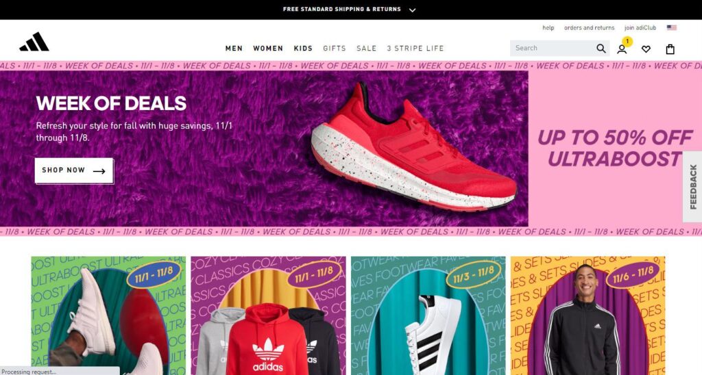
It always looks simple and elegant. This improves the usability. It not only becomes successful in catching the visitors’ attention but also helps them get up to date.
Having a well-arranged category helps customers find their products easily. A functional drop-down menu from where visitors can access those categories will improve your UX performance.
A customer would come to an eCommerce site looking for a product. Now, when they land on your web page, it becomes your responsibility to help them find that product on your site easily.
Placing an on-site search bar is considered user-friendly. Because it not only increases user engagement but also drives more sales. An on-site search bar makes your site more user-friendly. Hence, your online store’s UX performance improves.
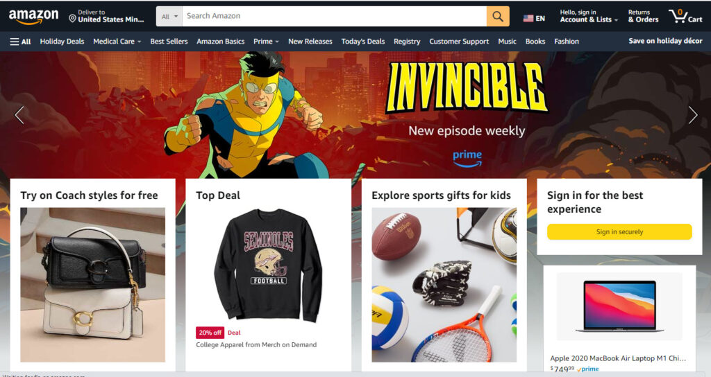
A case study of Amazon from Bayamrd tells us that they scored 84.0 in on-site search performance. With a simple drop-down menu, Amazon offers a search box that is very easy to use. Some of the best practices you can implement for on-site search include:
Another way to provide an effective search to users is by optimizing your eCommerce website’s product listing and filtering performance. It also helps improve conversion rates.
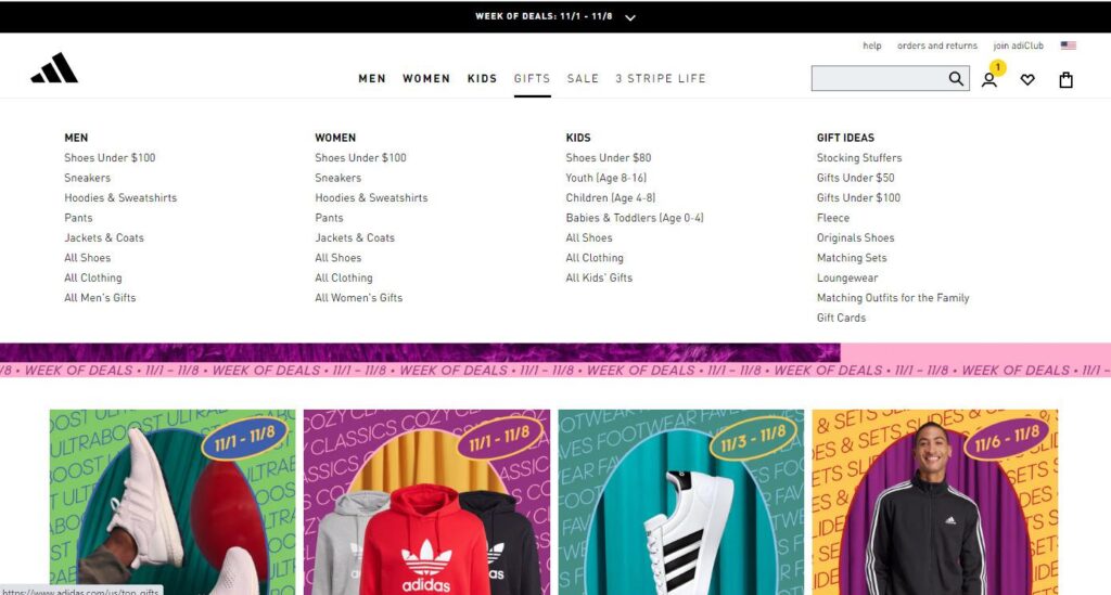
The product listing and filtering performance of Adidas is approximately 37. The comprehensive list of elements that Adidas and other top eCommerce stores use to achieve success with product filtering are as mentioned below:
People like to buy the best product they can get. Therefore, they browse through a variety of options and then select the top ones. These options will then be compared to finalize the product for purchase.
Most of us like to shop this way, it doesn’t matter if we are shopping from a retail store or an online one. In a retail store, we can compare products by putting them side by side. People want to do the same and compare the features and specifications of a product online too.
Best Buy offers product comparison where features and prices of the selected or top-selling products are compared side by side.
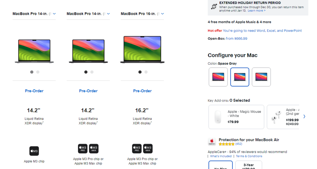
The most important thing to consider while offering such a feature is to know the deciding criteria of your customers. If you got that right then and only then your product comparison feature can enhance the user experience of the customers.
Not every customer who purchases from you or visits your site will have created an account with your online store. Many of those visitors wouldn’t even have time to create an account before making the purchase. Therefore, eCommerce stores must offer an option to select a guest account and checkout for buying products.
Moreover, if the account creation process on your site is lengthy and complicated then it is only going to drive visitors away. Instead, it should be simple.

The account selection and creation process on the Walmart store is good with 76.9 performance, as per the research from Baymard. The list of their required input fields is very short which does not bore customers away.
Place a free shipping sign on products and your conversion rates will increase dramatically. Customers love it when they get a discount. But when shipping charges are added to their purchase order, they feel like they are paying extra money for the product.
Of course, it’s to get the product delivered to their doorstep. But that little discount of making shipping free makes customers feel like that extra burden is taken off. Sometimes, because shipping is made free, customers tend to make a little expensive purchase too.
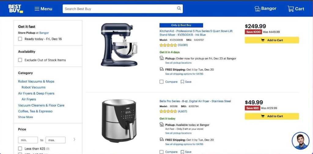
Apart from free shipping, you must also provide more shipping options to enhance the user experience. Best Buy offers store pickup and shipping to various locations with a performance of 95.6. They also provide estimated delivery time and other information like every major eCommerce website.
As we discussed in the account creation process, if the necessary forms for customers to fill have large and complex input fields then it will harm the UX performance of the website. When you are trying to sell a product, you have to do it as fast as possible otherwise the customer might lose interest.
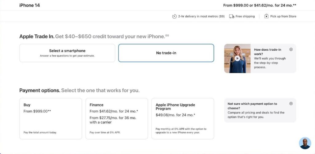
Therefore, you shouldn’t ask for unnecessary information and keep the input fields small and simple. Take Apple for example, they keep the required data to a minimum and simple. The customers also find it pretty convenient. Maybe that’s why their customer and address information performance is 52.7.
In an on-site search option, adding an auto-complete feature improves the user experience. Many top eCommerce websites including Amazon use this feature on their search bar.

How useful is this feature to customers?
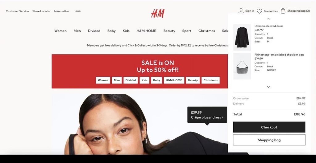
Before completing their purchase, eCommerce stores must offer order review and cart editing features to customers. This enables them to check out the general details of the order and edit items in the cart before placing their order and paying for it. The order review performance of H&M is 57.0 which is pretty good.
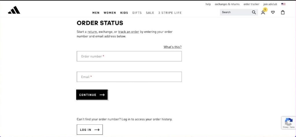
After placing their orders, customers are eagerly waiting to receive the product. Allowing them to track their order means enhancing their user experience. It is also a customer support service feature that enables the customers to know what happens after they place an order and how their parcel reaches them.
So, if there is a delay or any other problem, customers would know immediately by tracking their orders. More often, eCommerce websites get bad reviews and lose customers because of the lack of order tracking information and shipment failures.
Some of the best practices to implement for order tracking are as mentioned below:
You have to maintain the balance between being too generous and too strict about the return policy. In one way, your policy will be exploited and you end up losing a lot of money, in another way, customers will be afraid of buying things from you. So, either way, you are going to lose your business.
A right return policy will allow your business to gain the trust and loyalty of the customers which leads to increased business growth. It will also improve your site’s UX performance. Amazon has an amazing return policy which is customer-friendly but also benefits their business.
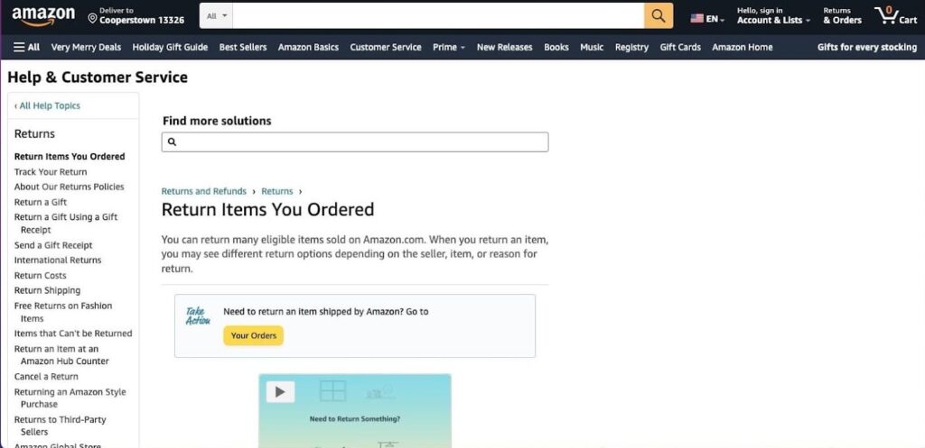
The order return performance of Amazon is around 125.0! After receiving the order, customers can opt to return it within a specific period. When you have a decent order return policy, customers can purchase products without hesitation. This boosts your sales and revenue.
Most customers browse and buy their favorite products using mobile phones. So, if you don’t want to lose out on a large customer base, you have to make your eCommerce store mobile-friendly.
Mobile eCommerce is booming. Apple, according to UX benchmarks, has mobile performance of 44.3. Their mobile interface is very simple yet elegant which offers a great user experience.

For better mobile eCommerce, you have to improve the UX performance of the following:
eCommerce business owners and developers often make common UX design mistakes that would have been otherwise easily avoidable. But it is also important to remember that there isn’t any one-size-fits-all kind of solution.
The UX best practices for eCommerce apps that we discussed in this blog work wonders in most cases. Meanwhile, some website-specific requirements might go unnoticed and only be revealed after a thorough UX audit.
More importantly, there is no one other than your users who would know the best and the worst things about your UX design. If you ask them, they will gladly tell you all about your site’s shortcomings. So, it is highly recommended to not avoid the users’ feedback.
On the contrary, you must actively seek out user feedback through surveys, review forms, online interviews, and more. The bottom line is to enhance the quality of your eCommerce website and the experience it provides to the site users. Once that is achieved, your online business ought to grow significantly.

8 Mistakes to Avoid When Scaling Remote Engineering Teams in 2026

DevOps and Cloud Automation: How Intelligent Tooling Transforms Reliability and Time to Market

AI Development Services: Moving from PoC to Production Successfully
Please feel free to share your thoughts and we can discuss it over a cup of tea.
Get a quote
8 Mistakes to Avoid When Scaling Remote Engineering Teams in 2026

Six Things to Consider When Hiring Remote Talent

ellow.io enters remote hires market with AI-based screening process